10 Essential Book Design Terms Every Author Should Know
If you are an author, it can sometimes seem like graphic designers speak an entirely different language when they talk about book design terms.
Here are some of the terms you might need to know when working with a designer. Even if you choose to create your covers, you still might find these terms helpful.
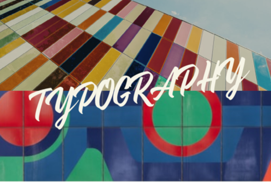
TYPOGRAPHY
Typography is the art of arranging text using a particular style and arrangement to make the type visually pleasing.
Typography uses different fonts (text display styles) and then uses the following to arrange them in different ways.
While graphic design can often visually communicate a concept without text, typography makes it possible to elevate text to the next level.
The audience reads the message but is not turned off by the stagnant design. Because the text is a part of the design, the audience is more likely to perform a call to action (aka buying your book).
It is also important to note that these terms apply when addressing your interior text formatting!
HIERARCHY
This refers to how the text is placed on a page or the computer screen.
It lets the audience find the critical information first, then establishes an order beyond that. Hierarchy allows your audience to understand your message clearly and ensures that your audience will be more reactive to the text.
For most book covers, you want the essential words to stand out.
Here is another example:

The audience is drawn in by the boldest word, “stands.” You can use this to draw attention to a specific term, encouraging the audience to take immediate action.
KERNING
This refers to the space between letters.
Too tight, and your words look cluttered and unreadable. Too spacious, and your audience is overwhelmed. In each of these cases, your audience will feel disconnected and may ignore your book altogether.
LEADING
Pronounced “leading,” this term refers to the distance between each line of text.
There was a time when typesetting was done by hand, and typesetters would use pieces of lead to separate the line.
Although we do not use this technique anymore, it is essential to ensure your text has enough space between the each following and preceding line.
Like kerning, if you have too much space between each word, your audience will have trouble reading everything.
This will also be the problem with too little space because the words will become jumbled up.
TRACKING
Similarly, tracking is the consistency of space.
You may have consistent tracking throughout, or you may decide to increase the space of a word over time like so:
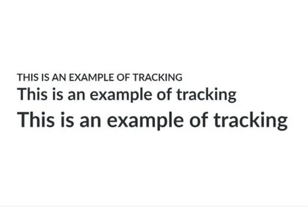
Again, your goal should be to allow your text space to breathe and be mindful of making the text too cramped or too spacious.
Your readers need to be engaged by the graphic design and understand what is being said.
VECTOR
You have heard this word if you have ever worked with a hardcover or paperback book. Images are typically either in pixels or vector format. A pixel image comprises a specific number of dots, meaning the image file is not scalable.
However, since a vector image is based on math, you can make it as big as possible.
For digital art, like eBooks, you can get away with creating pixel art.
For example, you are using photoshop to create a book illustration or your cover. However, if your image is going to be printed at all, even if the book is only a tiny chapbook, you will need a vector image. The same applies if you decide to create book without using words.
BLEED
You will need to know this term when working with paperback or hardcover books.
Bleed is anything that goes off the edge of a document and will be cut off during printing. You want to pay attention to the exact dimensions so that you waste time and energy.
Ensure that the “bleed” is set correctly so that none of your book text is cut off.
SERIF TYPEFACE
Now we are getting into my favorite part – fonts!
Serif fonts are typefaces with an additional stroke at the primary vertical and horizontal strokes.
Like so:

These typefaces are usually used for your interior book text and subheadings.
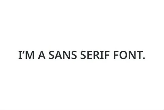
SANS SERIF TYPEFACE
On the other hand, San Serifs’ fonts are missing these extra strokes.
They are used for book covers, interior headings, titles, and anything you want the audience to read quickly and easily.
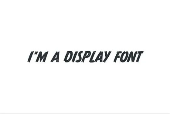
DISPLAY FONT
This is where you can lot of have fun! Display fonts are created to be artistic and, thus, are usually used only for book covers or the interior title page.
Though, that is not always the case.
There are plenty of fun design fonts to use for headers and subheadings. They can be significant and beautiful or small and creepy.
They can even be a series of letters or symbols.
Here is an example:
Remember, these are all the basics of book cover design.
One cannot, for example, have an innate sense of style and aesthetics; however, hopefully, this guide has made you more confident in designing your covers or knowing what to look for when hiring a designer.
MORE WRITING ARTICLES YOU MIGHT FIND INTERESTING


Discover 7 essential tips for crafting chilling horror novels, from understanding the biology of fear to using familiar settings for maximum unease.